Five looks, five scenes — step-by-step edits you can copy
Exact starting points for portraits, street, food, landscape and film-style photos: which collection, which sliders, which effects, in which order.
On this page
Knowing what every tool does is not the same as knowing what to do. These are five complete edits, written as steps, for five situations that come up constantly. Follow one exactly the first time, then start changing it — that is how a look becomes yours.
Every one of them assumes the same two opening moves: crop first, and correct the white balance before anything creative. If you skip those, the rest will not land.
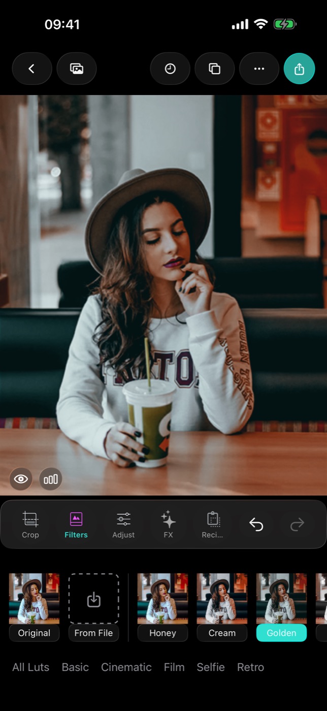
1. Portrait — flattering, not plastic
The goal is skin that looks like skin, in light that looks kind.
- Crop to 4:5, eyes about a third of the way down.
- White Balance → eyedropper → tap something neutral. Skin should not go orange or green.
- Selfie collection — try Portrait Glow, Milk Tea or Sunkissed. Tap the thumbnail again and bring it down to about 50%.
- Shadows up a little. Faces almost always have one side too dark.
- Clarity down slightly, or leave it at zero. Clarity is what makes skin look like a road surface.
- HSL → orange band: saturation down a touch, luminance up a touch. This is the single best skin adjustment in the app.
- Grain at 15–20%. Counterintuitive, but a little texture is what stops smoothed skin looking synthetic.
If there is a blemish, use Remove Spots before step 3, not after.
2. Street — contrast and weather
The goal is a frame that feels like a place, not a snapshot of one.
- Crop hard. Street photos are almost always improved by removing a third of the frame.
- Straighten — buildings make tilt obvious.
- Cinematic collection — Cinema Teal, Soft Bleach or Golden Cine, at 70–80%.
- Contrast up. Street work can take much more than a portrait.
- Clarity up — here it is welcome. Stone, brick, wet tarmac and coats all gain from it.
- Vignette, gently, to hold the eye in the frame.
- Grain at 25%, and Chroma at 10% if you want the old-lens feel.
3. Food — warm, sharp, appetising
The goal is food that looks like it smells good. Warmth and texture do all the work.
- Crop square, or shoot-and-crop straight down.
- White Balance → eyedropper on the plate, if it is white. Restaurant lighting is the worst light there is and this fixes most of it.
- Basic collection — Natural 100, Amber Vista or Faded Matte, around 60%.
- Temperature slightly warm on top. Cold food photography does not sell anything.
- Highlights down a little to save the shine on sauces and glasses.
- Sharpen modestly — texture is the whole point on bread, herbs, crusts and grill marks.
- Saturation barely up. Food goes radioactive fast.
Skip effects entirely. Grain on food looks like dirt.
4. Landscape — depth without the postcard
The goal is a scene with distance in it, and a sky that reads as deep rather than bright.
- Crop 16:9, horizon on a third — never dead centre unless there is a reflection.
- Straighten against the horizon itself.
- Cinematic collection — Sunset Film or Fog Bleach, at 60%.
- Highlights down to bring the sky back.
- Shadows up slightly so the foreground is not a silhouette.
- HSL → blue band: saturation up, luminance down. Deep, not bright, is what makes a sky look good.
- HSL → green band: saturation down a touch, hue slightly toward yellow. Untouched digital greens are the thing that makes a landscape look fake.
- Clarity up, moderately.
5. Film style — the analogue look, done properly
The goal is a photo that reads as film, not as a filter pretending to be one.
- Crop to 4:5 or 3:2.
- Film collection — Warm 800 or Everyday 200, at 70%.
- Fade up slightly. Film blacks are never truly black.
- Curves → lift the bottom-left point a little. Same idea, more control.
- Tone → warm highlights, cool shadows, gently.
- Halation at 30% — the warm bleed around bright edges is the most recognisable film signature there is.
- Grain at 25%.
- Dust at 10–15%, if you want the scanned-negative feel.
- Light Leak — optional, one photo in ten. Used on every frame it becomes a gimmick immediately.
Making these yours
Run one of these on five photos in a row. By the fifth you will have opinions — too warm, not enough contrast, grain too heavy. Change it, then save the result as a Recipe with the scene in the name: "Portrait — indoor", "Street — overcast".
Do that five times and you have a personal set of looks that fits how you actually shoot, which is worth more than any pack you can buy.